


Aerie: Real Beauty Campaign
A body positivity campaign concept celebrating shape, comfort, confidence, and range.
This campaign concept reimagines Aerie’s body positivity messaging through a simple visual metaphor: fruit. Each fruit represents a different shape, style, and expression of beauty, reinforcing the idea that real beauty is not defined by one standard.
The Challenge
Aerie’s brand is rooted in authenticity, inclusivity, and confidence. The goal of this campaign was to create a print and social concept that felt aligned with the Aerie Real platform while using a simple, memorable visual system.
The Idea
Different fruits represent different shapes — natural, recognizable, and visually distinct. By pairing each fruit with a lingerie style, the campaign celebrates range in both bodies and products.
Core Message:
Different shapes. Same confidence.
Print Campaign
The print series uses white space, editorial typography, and fruit photography to create a minimal, magazine-style campaign. Each ad keeps the message simple while allowing the visual metaphor to lead.


Final Copy System
Headline: Different shapes. Same confidence.
Body Copy: Real isn’t one shape, one size, or one standard. It’s comfort. It’s confidence. It’s range.
Closing Line: This is real beauty. You.
Instagram Extension
To extend the campaign digitally, I created a set of Instagram posts that translate the print concept into social-first formats.
The hero post introduces the full campaign message, while the carousel highlights each fruit individually as part of the product and body diversity story.
Hero Post
Different shapes. Same confidence.

Carousel Concept
Each slide spotlights one fruit and one product style, creating a simple swipe-through experience that reinforces the message: one shape, one style, still real.

Slide 1: High Waisted
Pear visual
Copy: One shape. One style. Still real.
Slide 2: Boybrief
Apple visual
Copy: One shape. One style. Still real.
Slide 3: Thong
Banana visual
Copy: One shape. One style. Still real.
Slide 4: Bikini
Strawberry visual
Copy: One shape. One style. Still real.
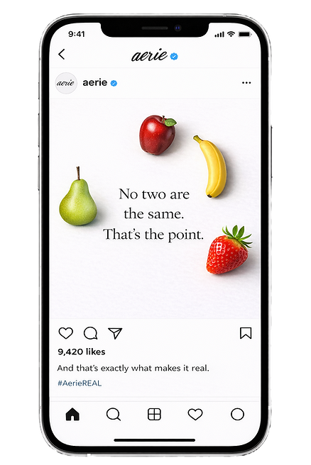
Scroll-Stopper Post
No two are the same. That’s the point.
My Role
Concept Development, Art Direction, Copywriting, Campaign Adaptation
I developed the campaign concept, refined the messaging, created the visual direction, and extended the idea across print and Instagram formats.
The final campaign balances simplicity and emotion, using a familiar metaphor to communicate body positivity in a way that feels approachable, inclusive, and aligned with Aerie’s brand voice.
Final Takeaway
This project shows how a simple concept can become a cohesive campaign system.
By using fruit as a metaphor for body diversity, the campaign communicates inclusivity without overexplaining it — allowing the message to feel natural, confident, and memorable.